Kids Place Logo Redesign
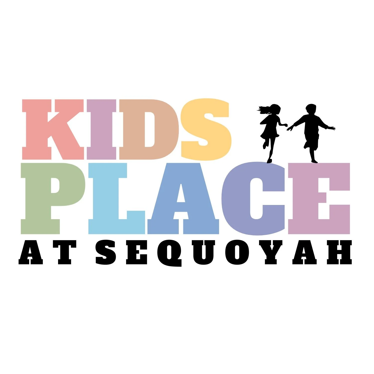
A thoughtful reimagining of the Kids Place brand, designed to better reflect its welcoming, playful, and community-focused environment. This project focused on creating a refreshed visual identity that feels both engaging for children and polished for families and staff.
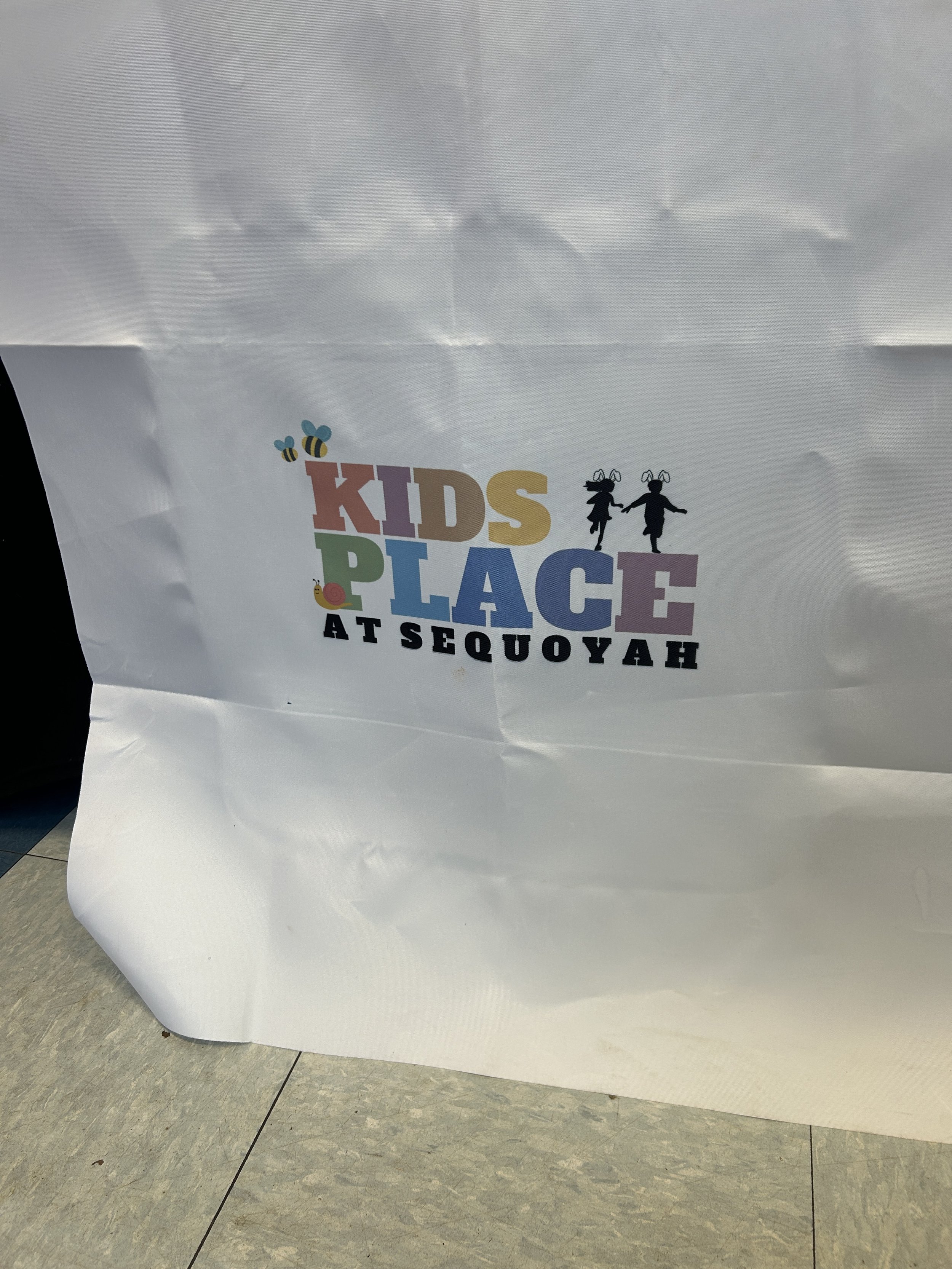
Through intentional design choices, the updated logo brings together clean structure with fun, approachable elements—balancing creativity with clarity. Color, typography, and overall composition were carefully considered to ensure the brand feels cohesive across all uses, from signage to digital platforms.
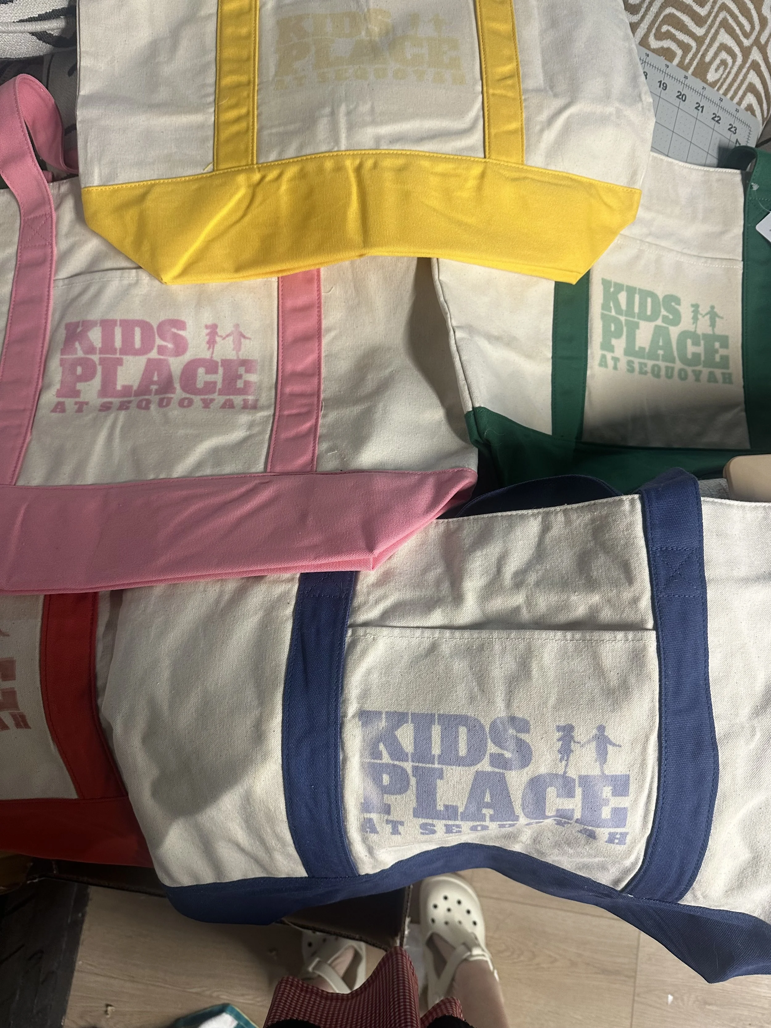
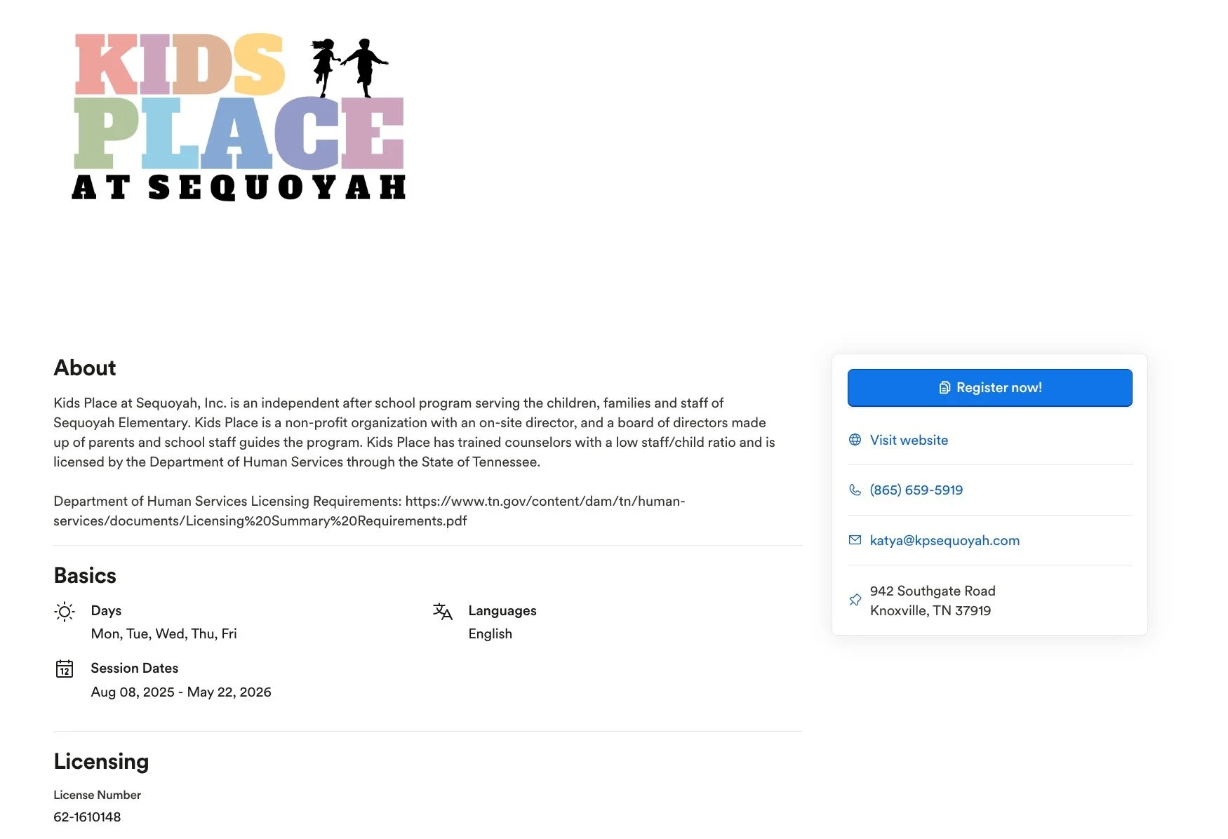
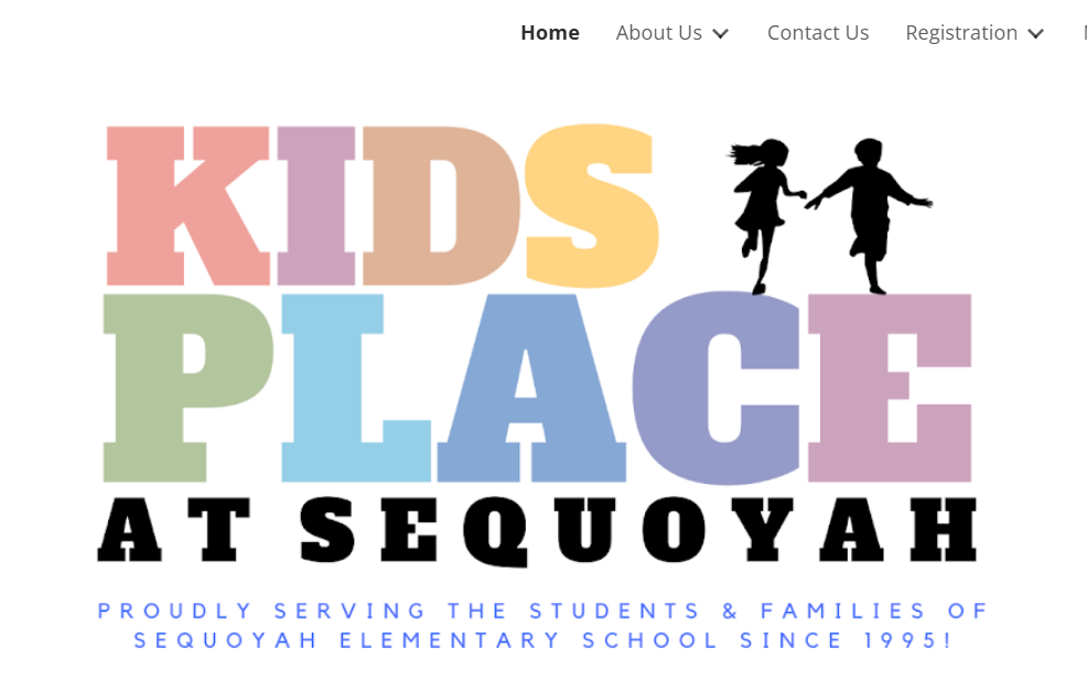
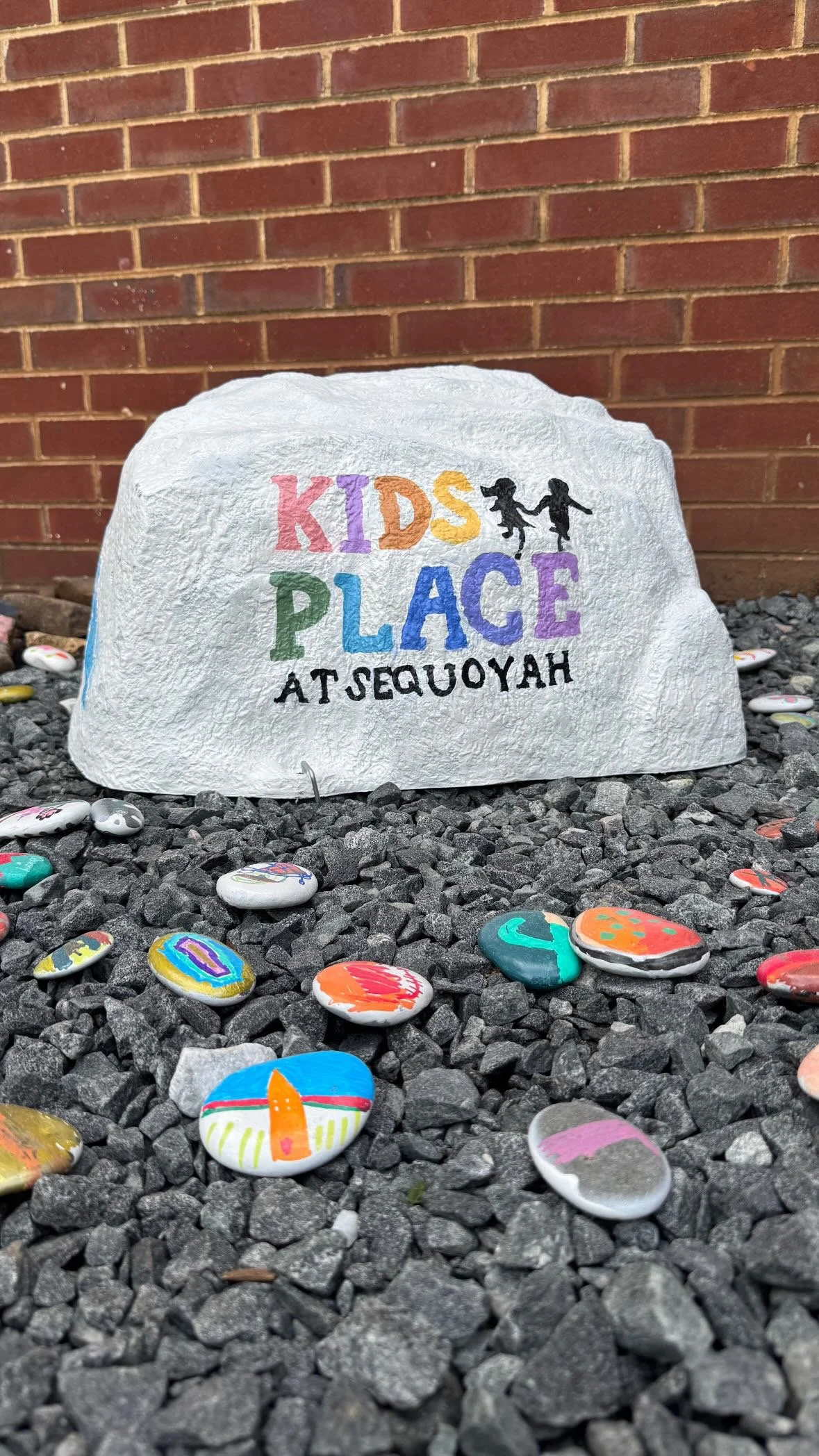
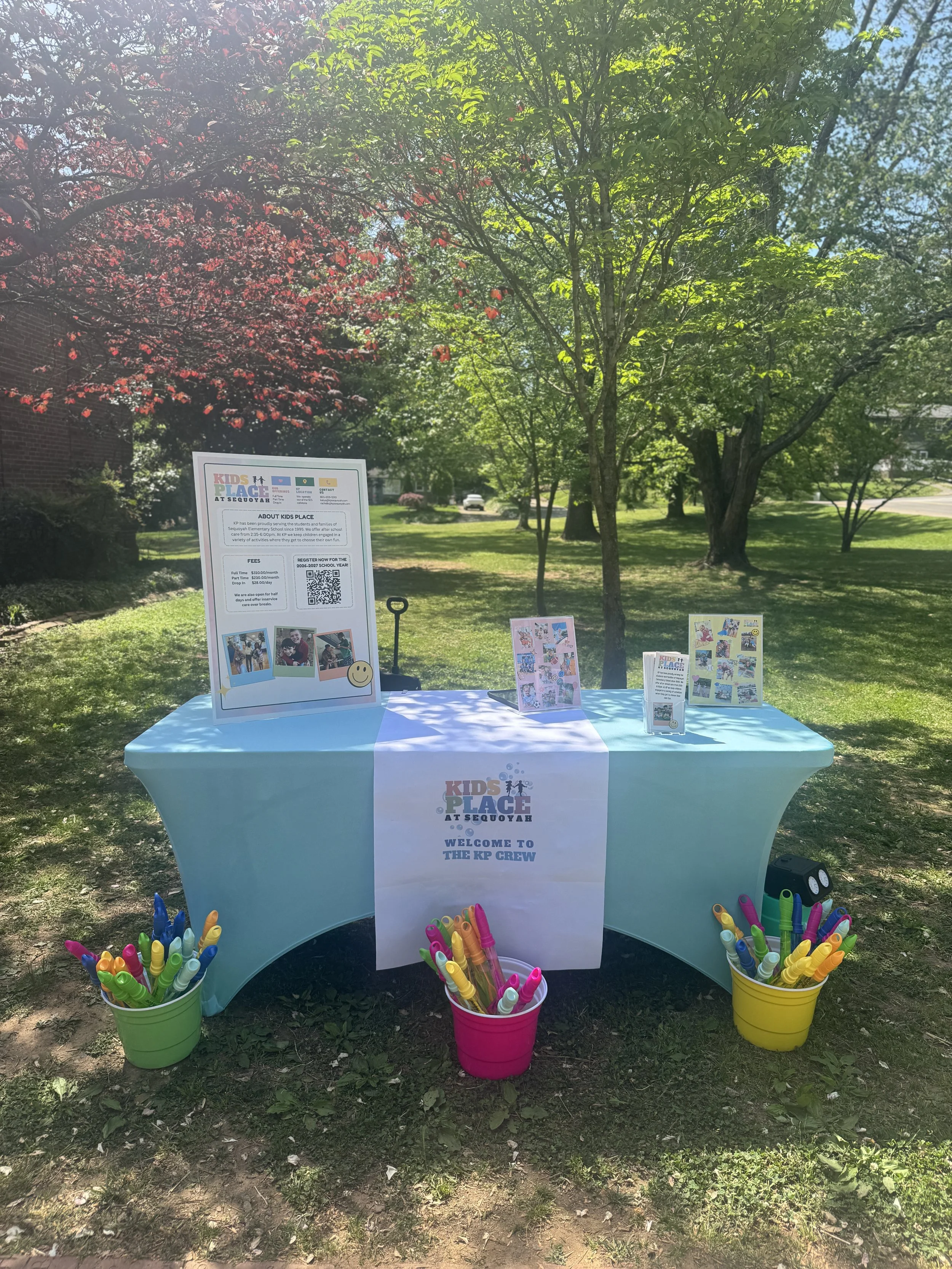
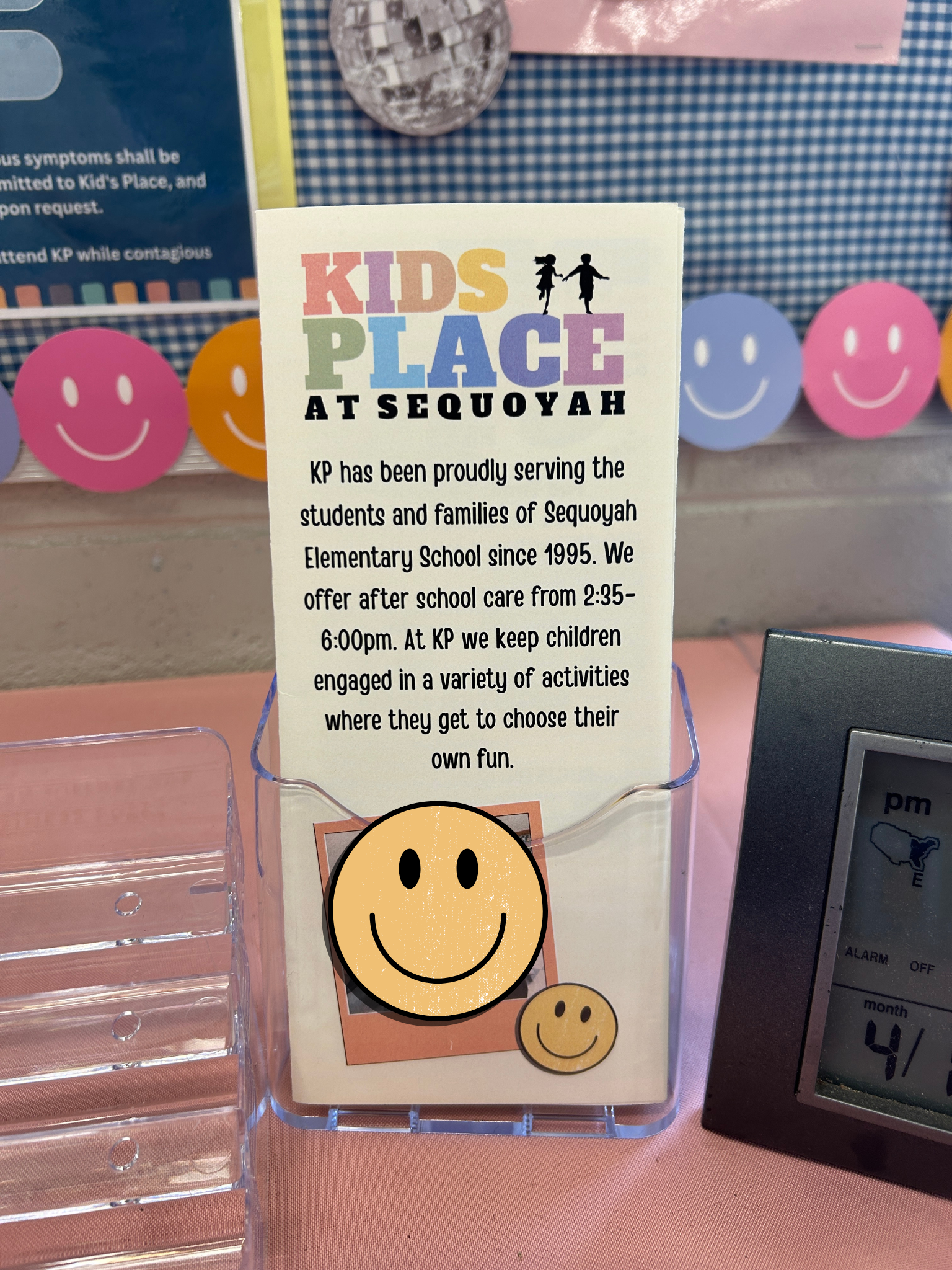
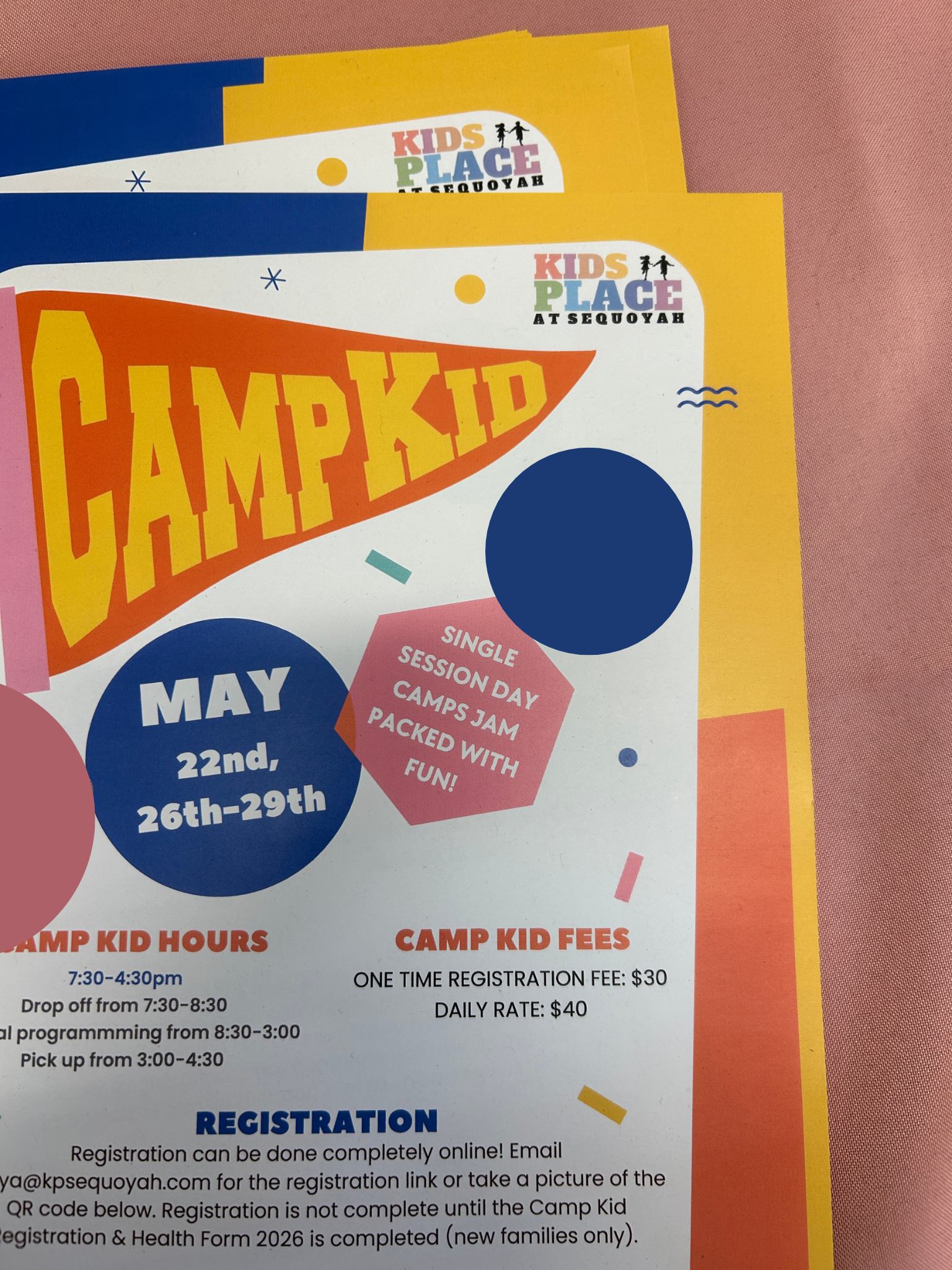
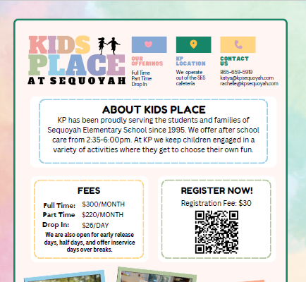
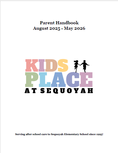
The result is a modernized identity that maintains the heart of Kids Place while elevating its presence. The brand is now clearly recognizable and consistently represented, allowing it to stand out across a variety of applications. From everyday materials to larger touchpoints, the logo has been seamlessly integrated into many elements of the brand—some of which can be seen below.