GCT Express New Logo
A strategic redesign of the GCT Express brand, created to better reflect its professionalism, reliability, and forward-moving identity. This project focused on developing a clean and recognizable visual presence that aligns with the company’s values and industry.
Through intentional design decisions, the updated logo emphasizes clarity, strength, and simplicity—resulting in a mark that is both modern and highly functional. Typography, color, and overall composition were carefully refined to ensure consistency across all platforms, from digital use to printed materials.
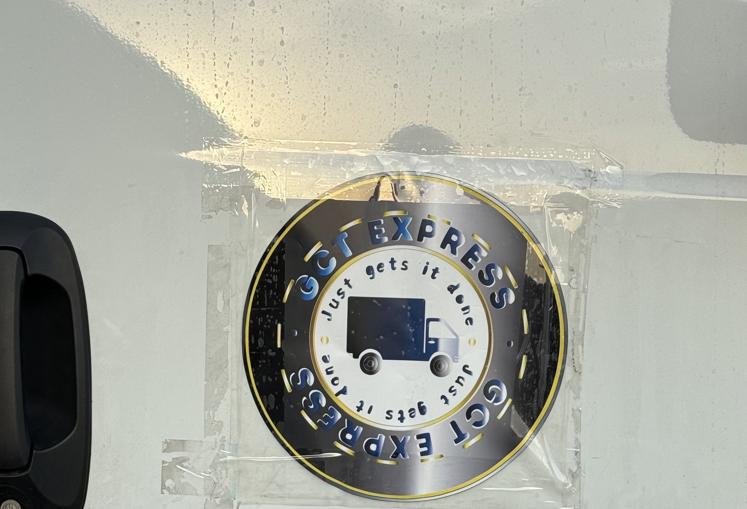
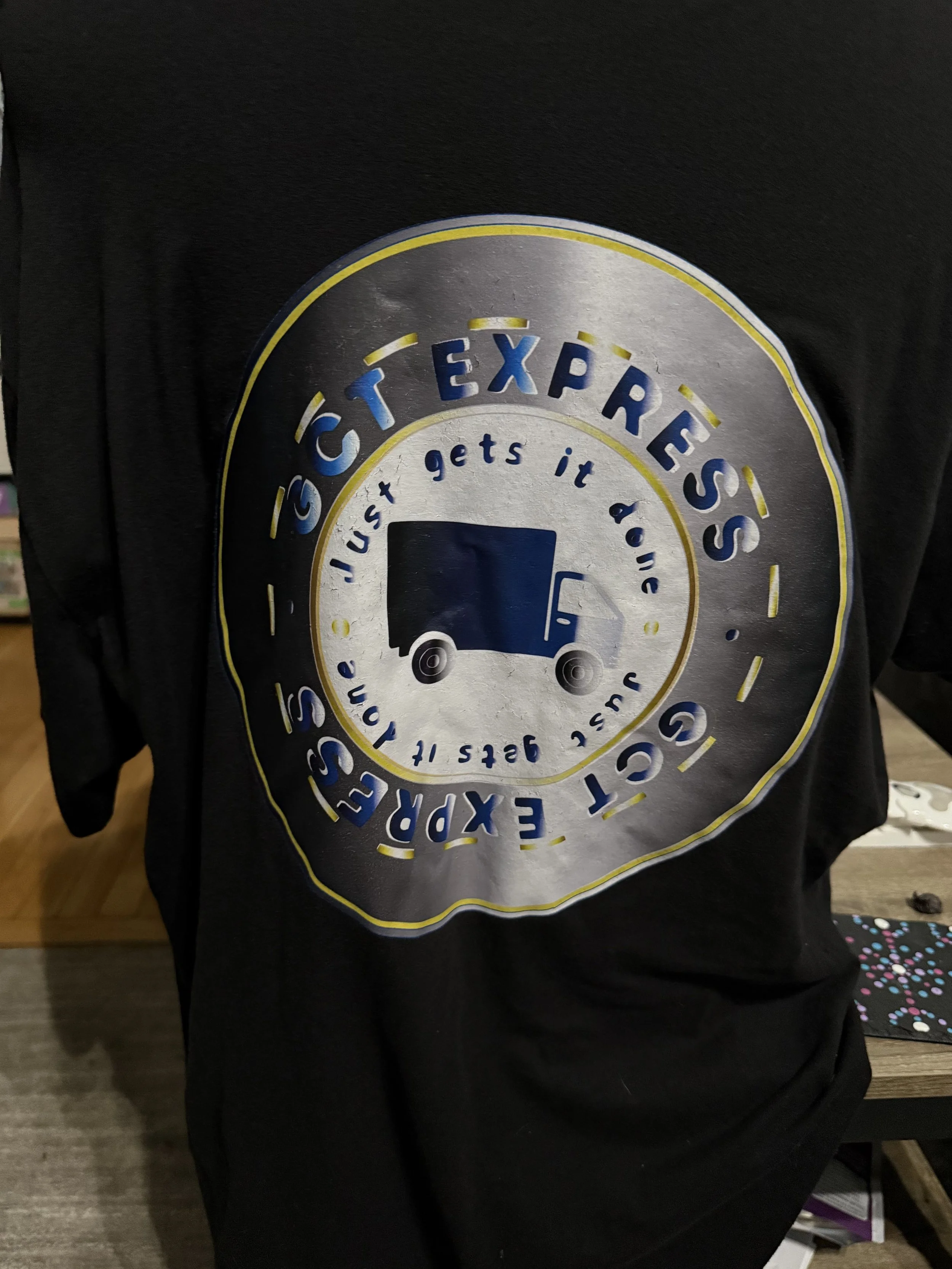
The result is a cohesive and elevated brand identity that enhances recognition and builds trust. The updated logo is now clearly identifiable and has been applied across a wide range of brand elements, creating a consistent and professional presence—some of which can be seen below.